Experience a story
Experiences to treasure.
Stephen King offers an interesting quote about storytelling …
There are books full of great writing that don’t have very good stories. Read sometimes for the story … don’t be like the book-snobs who won’t do that. Read sometimes for the words – the language. Don’t be like the play-it-safers who won’t do that. But when you find a book that has both a good story and good words, treasure that book.
This notion can be applied to customer and user experience design. Creating an experience is like writing a book. The user is the reader and the design team the author. The concept is the substance of the story, the plot. And the design and execution are the words, the language.
Like books, there are experiences that tell great stories without great execution. And then there’s beautifully designed experiences that lack substance.
We need to create experiences like the books we treasure – wonderful stories conveyed beautifully. The challenge is doing both in tandem: tapping into users’ mindsets to tell a story that connects and telling that story in the best way possible, free of distractions.
You can fix anything but a blank page.
Nora Roberts
Author
The process.
Storytelling takes a very specific and refined skill set. It takes time to get from an initial artistic vision to an end-product. In the case of writing, the progression might go from an idea and outline, to draft, to proof. And through several iterations where the story and writing are both considered and distilled to be their best.
In experience design, the progression is similar, moving from wireframes to static mockups and finally to high-fidelity interactive prototypes. This gives designers the opportunities necessary to find the right combination of elements to create something worth treasuring.
It’s important to understand these distinct – but interrelated – design deliverables so that you’re not just creating a good story. Or a beautiful design. But an experience that’s both.
If you're trying to persuade people to do something, or buy something, it seems to me you should use their language, the language they use every day, the language in which they think.
David Ogilvy
The Father of Advertising
Wireframes.
The outline
In writing, the author might begin realizing an idea with an outline. The parallel in UX is a wireframe. Here, the designer establishes hierarchy, structure, the user journey and the calls to action.
Wireframes are low-fidelity blueprints that enable quick ideation and multiple iterations. They illustrate the stories we can tell through our experience.
What I use: Whiteboard, Paper, Illustrator, InDesign, Balsamiq, Omnigraffle, Axure, Sketch (and many others)
Static mockups.
The draft
Like a draft in writing, mockups are where designers explore and experiment with (visual) language. Mockups allow designers to instill branding, explore imagery in conjunction with messaging, create unique graphics and add other artistic elements like iconography, texture and color to present a high-fidelity representation close to the final customer-facing experience. As you might expect, creating mockups is time intensive. That’s due to the care put into infusing beauty into the experience.
Rapid ideation and iteration are more challenging to demonstrate in mockups than wireframes. But the benefit of mockups is that they make the concepts presented in wireframes tangible – and are an accurate depiction final product. This step follows wireframing because where wireframes established the plot, the mockups establish the language in which the story will be told.
What I use: Photoshop, Illustrator, Fireworks, InDesign
Interactive prototypes.
The proof
Now that the story (experience presented in wireframes) and language (design presented in mockups) has been crafted, it needs to be read.
Prototypes allow an interactive exploration of our story … we can enjoy it as if it were already developed and in market. By interacting with a prototype we can test how our plan has come to life and we can make improvements prior to sharing with our users.
This ensures that we spend less time making improvements and adjustments while in development. And it ensures the highest quality end product will make it to our users.
What I use: InVision; Marvel, Axure, Avocado
When you see a fashion show, you see those seven minutes of what was six months of tedious work of, you know, going up an inch and down an inch, changing it from one shade of red to another shade of red. So it's the same as any creative process. The result is what we see, but the process is really labor intensive.
Marc Jacobs
Fashion Designer
Why the process?
By moving from one step to another, you’re allowing time to consider and evolve the work thoughtfully. And you’re creating opportunities to collaborate with your team. Through this consideration, collaboration and evolution, your concept will naturally develop and mature, becoming more cohesive and intuitive; your design will be refined to convey that concept in a way that appeals to users’ eyes and minds.
Chances are you are working with experienced professionals that have the expertise to jump ahead. And sometimes that’s necessary. But you might be skipping the step that would have made your experience something your users would truly treasure.
The digital creative
Converging disciplines.
A question you might have had, whether interviewing for a role, growing your team or personally contributing: how do user experience responsibilities overlap with those of a creative director? And subsequently, is the user experience practice limited to digital or does it venture into traditional terrain as well?
With digital playing a crucial role in nearly every growth and marketing campaign, user experience design is as critical a contribution as traditional creative – visuals and tone – to the success of any initiative.
Design can solve society’s biggest problems … if we cultivate a love of learning through the design process.
David Sherwin
Director of User Experience at lynda.com
Consider the role.
As a creative director, you facilitate all aspects of the creative process. You’re a guide for your team with skills and experience related to design, fine arts, motion graphics, writing and/or other creative industry fields.
In traditional mediums, such as print or television, this means strategic and on-brand use of color, typography, messaging, video, music, imagery, etc. These types of endeavors require a ‘man behind the curtain’ (or a very closely-nit team) making sense of the chaos and ensuring alignment to a shared vision. In total, a creative director’s goal is overseeing all creative deliverables to ensure strategic alignment, proper branding, consistency, and quality.
Not an easy task in itself, but add the mechanics and the interactivity of digital deliverables and diverse channels, like, extended reality, voice interfaces, mobile, desktop, and social, and it’s easy to be overwhelmed.
You don’t have to change who you are. You have to be more of who you are.
Sally Hogshead
New York Times Bestselling Author
Add more to your thinking.
The need for user experience thinking and skill can’t be neglected if you want to create a great product, one you’d want to use. It’s a layer of thinking that’s as important as the strategy, art and writing.
But resources are limited and it’s your responsibility to oversee the overall quality of a campaign; so you need to be a hybrid. And an ever-evolving, curious one. As a digital creative director, you must not leave the user experience to someone else, even if there’s the benefit of having an expert on your team. It’s just another facet of the final product to which you can contribute.
Principles of user experience design will benefit more than just your digital deliverables. This mindset will challenge you to consider your campaign from your audience’s perspective. You’ll more deeply consider how each tactic is connected to the next and how to ensure that each has the desired outcome, similar to a path-to-purchase in traditional shopper marketing.
Adopting these principles, you’ll approach the campaign as an interconnected journey, not just a creatively consistent one.
Those who learned to collaborate and improvise most effectively have prevailed.
Charles Darwin
Bring them together.
Of course, having (or acquiring) user experience expertise doesn’t eliminate the need for a diverse team with their own unique specialities. Differing points of view and areas of focus only make the work better and from collaboration comes the best results. So it’s important to acknowledge where your contributions are best and most efficiently applied based on your team.
But by adopting user experience into your personal skill set, you’ll better adapt to the team’s abilities and fill any gaps. Even better, when you apply your new thinking more broadly, your work will be more than a cohesive campaign; it will be an interconnected experience.
Inclusive by design
Diversity is a start.
Inclusivity is the goal.
Many places I’ve worked are striving for diversity. They have initiatives for employees, like LGBTQ-ally programs and minority workshops. And formal – and informal – incentives for hiring “diverse” candidates. That’s a good start.
But if I’m being honest, there’s not been any that have felt effortlessly and authentically inclusive – at least for not more than a few moments. But when those moments happen – or when you visit an office where there’s an easy atmosphere of all people feeling valued, heard and respected with the same access to the same opportunities – it’s magic. And you don’t know what you’re missing until you’ve witnessed it.
As employees in tech, we have to make an effort to foster an inclusive culture and model the behavior we hope to see in others. We need to encourage the shift from outdated paradigms. And – especially as designers – we need to wield our unique power and strive to be inclusive in our work that’s experienced by so many.
By no means exhaustive, but here’s some things I keep in mind …
Seek diverse points-of-view
Hear people out
Embrace the the unfamiliar
Be curious and ask questions
Avoid stereotypes
And represent everyone in the work (some resources below)
Make your work more inclusive.
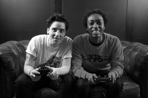
The Gender Spectrum Collection is a stock photo library featuring images of trans and non-binary models that go beyond the clichés. This collection aims to help media better represent members of these communities as people not necessarily defined by their gender identities—people with careers, relationships, talents, passions, and home lives.
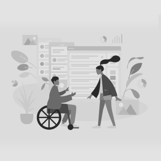
Humaaans is a free library of mix-&-match illustrations. You can customize people’s positions, clothing, colors and hairstyle to create some unique, inclusive scenes. Rotate and position the elements in your humaaans however you like. They’re like legos made out of flesh … and vectors. And add backgrounds to make them your own.
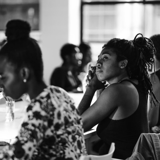
Nappy provides beautiful, high-res photos of black and brown people to startups, brands, agencies, and everyone else. It’s easy for companies to be purposeful about representation in their designs, presentations, and advertisements. And the images aren’t generic like a lot of stock photography, so it’s easy to be inclusive and authentic.
Jopwell’s smaller selection of photography features diverse coworkers in an office setting. The first collection is live and that there’s a first collection, we might hope that additional ones are to follow. Making use of the photos is free with a visible attribution to Jopwell.
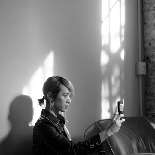
A nicely curated selection of Muslim women found on Getty Images. You’ll find photos of Muslim women in casual and professional settings. While a few images may read a little too “stock” overall there’s a nice selection.
Getty Images partnered with Verizon Media and the National Disability Leadership Alliance to create a growing collection of images that break stereotypes and more authentically portray individuals with disabilities. The collections works with contributors to expand and grow it over time.
It's trending
Fear the scroll, no more.
Think back in time and you’ll recall the mandate for having as much content “above the fold” as possible. Perhaps that’s still something you hear. Well, this has led to countless cramped designs –some of mine included – with little to no white space. And the inherent challenge of creating hierarchy with so much content competing for attention.
Partly because we consume more content on mobile devices and partly because we’ve becoming accustomed with scrolling in general, you’ll see less sites’ content constrained “above the fold.”
Using as much height as the content warrants, vertical scrolling naturally lends itself to storytelling. It’s easy to establish clear, intuitive hierarchy. A byproduct is larger, more legible text, immersive imagery and minimalist designs with increased whitespace.
Before you leave the house, look in the mirror and remove one accessory.
Coco Chanel
Grids galore.
Whether its due to standardization and proliferation of content management systems, the need to easily restructure content for responsive sites or to design patterns created by Google (Material Design) and Microsoft (Metro), you’ll increasingly see grid-based, card-style layouts.
While the grid is here to stay for the reasons above, look for designers finding ways to challenge the constraints this imposes.
Adorable animations.
Perhaps due to the layout constraints, you’ll find designers looking for opportunities to add unique personality to websites and apps. A great way to do that, without breaking a grid-based layout, is utilizing animations.
Whether it’s an elegant fade, a friendly bounce or an impactful product demonstration, animation in content, design elements and interactions will become more commonplace.
Secondary video.
High-speed Internet connections at home and on the go and better video plugin integration has made it easier to deliver high-quality video en masse. While load times are always critical when delivering content, there’s less fear that your audience won’t have a suitable connection, especially when video can be loaded in the background without impacting the presentation of other content.
High-quality video content, the new norm with more streaming services than you can count, will naturally continue. And video as a design element, in backgrounds and secondary placements will become more common.
And now, I'm just trying to change the world, one sequin at a time.
Lady Gaga
A little less flat.
Google released its Material design language back in June 2014 but the adoption has been slow with more flat design prevailing. Designers’ understanding of Material design is growing and I anticipate it more as documentation and real-world executions become widespread.
Material design focuses on tactile, dynamic elements that are reminiscent of physical paper and ink. Shadows are realistic, items overlap as they would in physical space and interactions stay inside of a defined ‘material’ without impacting other elements.
Since we’ve seem to have reached peak flat design, designers are opting for the next thing. Google offers that up in their Material design language. And given that it’s not a severe shift from flat design, I anticipate seeing the aesthetic more in 2016.
Single-wide.
Desktop design is taking cues from mobile; with many opting for a mobile-first approach to designing responsive websites, it’s natural that design patterns would transfer from mobile when it comes time to tackle the desktop layout.
Sites and apps are more frequently presenting all types of content in a single column. But this is especially true for forms and input screens (such as shopping cart checkouts, signups and logins). Click on “login” and or “contact” and you’re greeted with a full-screen overlay instead of the browser loading a new page.
This trend makes sense. It reduces time taken loading a new screen and gives more screen space for less precise touch interaction. This encourages users to complete the form.
